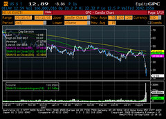
I promise this is not turning into a financial blog, but I have experienced in my career four events which I would classify as significant market corrections, and I have never seen anything like what is happening now. Today's horror story is Morgan Stanley's share price graph, grabbed a few minutes ago. I think this is what they call "conviction selling." For those unfamiliar with technicals, this is a candlestick chart, and the candlesticks at the top are the intra-day trading range of the stock, bars at the bottom are volume. What is striking, apart from the sheer magnitude of the drop, is the huge price swings in the last couple of sessions, and also the volume. It's not total capitulation, but it's damned close.
UPDATE at 10:50 PM London: MS has staged a late rally back into positive territory, which is of course great news, but I wonder what underpins it. Funds refusing to lend stock to shorts, rumors of rescue packages, etc. - maybe positive for the firm specifically, but do these really alter the fundamental landscape? I would say no.
Thursday, September 18, 2008
Subscribe to:
Post Comments (Atom)


No comments:
Post a Comment